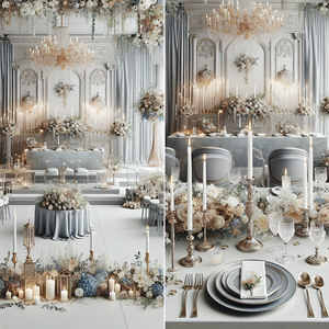
Looking for 2028 wedding colors? Start with robin’s egg blue and ivory for a soft garden look, butter yellow and lilac for a cheerful spring palette, or chocolate and blush for a warmer fall reception. Explore all ten wedding color schemes below, with hex codes and ideas for using them in your venue.
I’ve put together ten wedding color palettes for 2028, with ideas for using each one across your flowers and decor. You’ll find gentle blues, garden greens and some richer combinations if you love a little more depth.
This is an early inspiration guide for couples planning ahead. These are my styling suggestions, rather than a confirmed forecast of the most popular 2028 wedding colors.
Already have a color in mind? Let’s see it in your venue.
Upload a photo of your venue to the Design Studio, bring along the inspiration you love and see how your wedding colors could come together in your own space.
See My Colors in My VenueYour first design is free.
Still exploring? Create your wedding color palette or make your free wedding mood board .
A good place to start: choose one color you love, a neutral that works with your venue and a supporting shade. The five colors in each palette below give you options; you don’t have to use them all equally.
10 Wedding Color Palettes for 2028
Use the hex codes to save your favorite shades or try them in our free Wedding Color Palette Creator . They are a digital starting point. Fabrics, flowers and lighting will affect how the colors look in person.
- 1. Robin’s Egg Blue and Warm Ivory
- 2. Butter Yellow and Soft Lilac
- 3. Dusty Rose, Olive and Linen
- 4. Cobalt Blue, White and Pear Green
- 5. Peach, Apricot and Soft Terracotta
- 6. Chocolate Brown, Blush and Cream
- 7. Plum, Mauve and Champagne
- 8. Burgundy, Pale Pink and Vanilla
- 9. Forest Green, Pale Blue and Soft White
- 10. Warm White, Oat and Champagne
1. Robin’s Egg Blue and Warm Ivory
Venues to consider: Gardens, coastal venues and light-filled estates.
Robin’s egg blue #A8CBCB · Warm ivory #F6F0E3 · Pale aqua #D9E7E2 · Soft olive #8D9C85 · Champagne #C6B18F
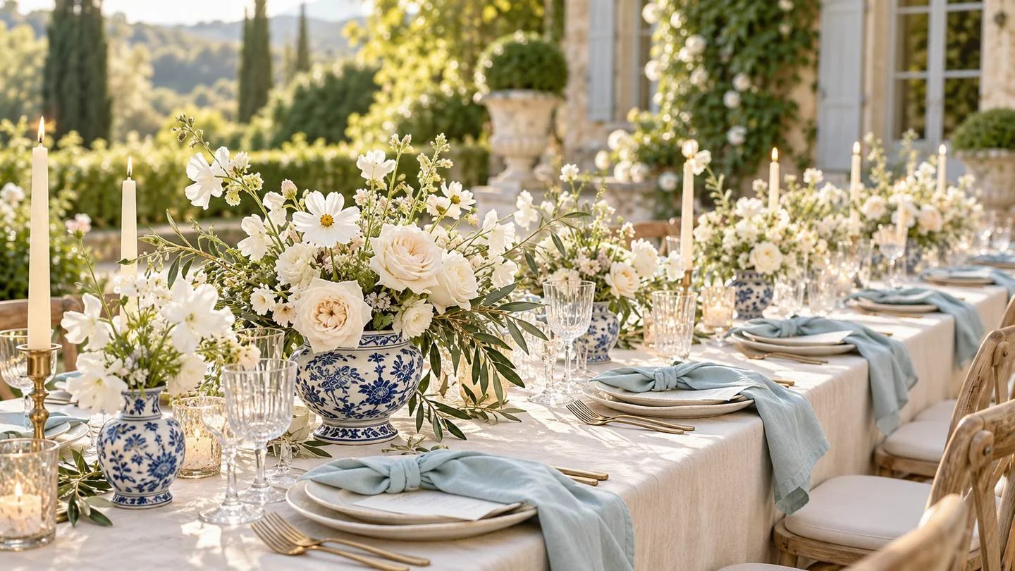
This is a lovely direction if you keep saving blue-and-white pottery, airy garden tables and soft ivory flowers. The blue has a little green in it, which gives it a gentler feel than a crisp powder blue.
Try ivory linens with blue napkins and blue-and-white vessels. White or cream flowers let the pottery stand out, while small touches of olive connect the table to the greenery around it.
Styling tip: if your patterned vessels are the detail you love most, keep the plates and stationery fairly simple so the table has a clear focal point.
2. Butter Yellow and Soft Lilac
Venues to consider: Garden ceremonies, greenhouses and bright tented receptions.
Butter yellow #F2E3A2 · Soft lilac #B8A6CD · Cream #FAF5E9 · Leaf green #A1AD8A · Pale lavender #DBCCD9
Butter yellow and lilac bring a cheerful feeling to a spring or summer wedding. Cream gives the two colors a little breathing room, especially if you want a soft overall look.
Use pale yellow flowers as the main color, then weave lilac through smaller blooms or napkins. Ask your florist which yellow and lavender-toned varieties are available around your date before choosing specific flowers.
Styling tip: let one color lead. Mostly yellow flowers with a few lilac stems will feel different from an even split, so look at both options before deciding.
3. Dusty Rose, Olive and Linen
Venues to consider: Vineyards, garden estates and rooms with warm wood finishes.
Dusty rose #C99599 · Olive #7C8564 · Linen #E9DFCE · Soft ivory #F8F2E9 · Deep rose #A76878
If you love pink but want a little more warmth, try dusty rose with olive and natural linen. It’s an easy combination to picture in a vineyard, a garden or a room with warm wood finishes.
Mix soft pink flowers with cream blooms and leafy greens. Olive napkins can give a pale table more definition, while the deeper rose works well in a few floral accents or the lettering on your stationery.
Styling tip: put your linen sample beside your dress fabric and stationery paper. A warm beige linen can look quite different beside a cool white.
4. Cobalt Blue, White and Pear Green
Venues to consider: White ballrooms, courtyards and modern venues with simple finishes.
Cobalt blue #3158B5 · Soft white #FAFAF4 · Pear green #BBC777 · Pale blue #D8E2EE · Botanical green #77845C
Cobalt is a good option if pale wedding colors leave you wanting something stronger. Against white linens, even a few blue details can change the whole feeling of the table.
Try blue glassware or patterned plates with white flowers and fresh green accents. For a more colorful reception, bring the cobalt into napkins or table runners, then keep the surrounding details quieter.
Styling tip: choose where you want the blue to appear before ordering. Strong blue linens will create a much bolder room than blue glassware on an otherwise white table.
5. Peach, Apricot and Soft Terracotta
Venues to consider: Stone courtyards, vineyards and outdoor early-fall receptions.
Peach #E8B39A · Apricot #D99870 · Soft terracotta #BB7865 · Warm cream #F7ECDC · Muted olive #93956F
This warm palette gives you a softer way to use orange. Peach and cream can lead a summer design, with terracotta adding depth as you move toward an early fall celebration.
Picture loose peach and apricot flowers on cream linens, with terracotta-toned napkins and natural wood chairs. Warm stone walls can also sit comfortably alongside these shades.
Styling tip: check the palette against your venue’s flooring. If the room already has strong orange-toned wood, use more cream and peach to balance it.
6. Chocolate Brown, Blush and Cream
Venues to consider: Historic rooms, wood-lined venues and candlelit evening receptions.
Chocolate #594036 · Blush #E6BFC0 · Cream #F5EDDE · Caramel #B38A6D · Muted green #8B906E
Chocolate brown gives blush a warm, grounded setting. You can use it lightly through ribbon and printed details, or make it a larger part of the design with brown linens.
For a candlelit fall reception, try chocolate napkins with cream linens and blush flowers. If you choose dark tablecloths, lighter plates and flowers will help the place settings remain easy to see.
Styling tip: photograph your samples together under the venue’s evening lighting. Brown fabrics can appear much darker once the lights are dimmed.
7. Plum, Mauve and Champagne
Venues to consider: Historic houses, intimate ballrooms and evening celebrations.
Plum #603D58 · Mauve #B08B9D · Champagne #D7C3A4 · Ivory #F4ECE3 · Olive grey #85836D
Plum and mauve are worth exploring if you love a romantic look with a little depth. Champagne and ivory soften the darker purple, giving you room to vary the balance from ceremony to reception.
Use ivory as your base with mauve linens and a few plum flowers. Or choose plum napkins and stationery, keeping the floral arrangements mostly pale. Both versions can suit a historic room or an evening ballroom reception.
Styling tip: champagne fabric and metallic gold are different finishes. Order samples rather than assuming they will look the same because the names sound similar.
8. Burgundy, Pale Pink and Vanilla
Venues to consider: Gardens, vineyard receptions and light neutral rooms.
Burgundy #732B40 · Pale pink #EDC9CD · Vanilla #F5E8CE · Berry rose #BA7486 · Olive leaf #7D8968
You don’t need a dark room to use burgundy. Against pale pink and vanilla, a few deeper flowers or burgundy ribbons create contrast while the overall design stays light.
This is a flexible option for a late-summer or fall wedding. Start with cream linens and pink flowers, then decide how much burgundy you want in the arrangements, candles and stationery.
Styling tip: repeat your deepest shade in a few places around the room. That will help it feel connected rather than appearing only in one bouquet.
9. Forest Green, Pale Blue and Soft White
Venues to consider: Woodland settings, garden venues and winter receptions.
Forest green #304F43 · Pale blue #C1D5E3 · Soft white #F5F5EF · Sage #99AF9B · Silver grey #C4C8CB
Forest green and pale blue give you contrast without relying on warm pink or peach. The combination can feel especially at home beside garden foliage or a wooded ceremony space.
Try pale blue napkins with white flowers and deep green foliage. For winter, bring the forest tone into your textiles and use silver-toned details if they suit the room.
Styling tip: look at the existing greens in outdoor venue photos. Blue-green foliage and bright yellow-green leaves will change how this palette feels.
10. Warm White, Oat and Champagne
Venues to consider: Venues with warm stone, pale walls or natural wood details.
Warm white #FAF7F0 · Oat #DCCEB8 · Champagne #C8B08C · Pale stone #EAE3D8 · Muted olive #9A9B86
If you keep coming back to neutral weddings, give yourself permission to stay there. A soft palette can have plenty of interest when the materials and flower shapes vary.
Pair textured oat linens with warm white flowers and clear glass. Champagne-toned stationery or ribbon adds warmth, while a little foliage can help the design feel connected to the venue.
Styling tip: compare your whites together before buying. A bright white napkin can look quite cool beside a creamy tablecloth, so check the combination in person.
Wedding Color Ideas for Every Month of 2028
If you have your date but haven’t chosen your colors, use your month as a starting point. These suggestions follow a typical Northern Hemisphere seasonal calendar; adjust for your climate and the actual setting. Any palette can work beyond the month suggested here.
| Month | Try this palette | How to use it |
|---|---|---|
| January | Forest green and pale blue | Balance deep greens with pale textiles in an indoor reception. |
| February | Plum, mauve and champagne | Try mauve as the main fabric color with smaller plum accents. |
| March | Robin’s egg blue and ivory | Use warm ivory to soften blue in cooler early-spring light. |
| April | Butter yellow and lilac | Ask your florist about locally available spring blooms. |
| May | Dusty rose, olive and linen | Compare the olive swatch with the foliage at your venue. |
| June | Cobalt blue, white and pear green | Keep large surfaces white if you want the blue to stay an accent. |
| July | Peach, apricot and terracotta | Let peach and cream lead for a lighter summer interpretation. |
| August | Robin’s egg blue and ivory | Try blue-and-white vessels with simple linens for an outdoor table. |
| September | Burgundy, pink and vanilla | Add a few deeper blooms to a mostly pale floral design. |
| October | Chocolate, blush and cream | Check dark fabrics under the room’s evening lighting. |
| November | Plum, mauve and champagne | Use lighter plates and linens to balance a richly colored room. |
| December | Warm white, oat and champagne | Build interest through texture and check existing holiday decor. |
Which 2028 Wedding Colors Suit Each Season?
Your season is a useful starting point, especially when you’re thinking about flowers and the landscape. It doesn’t have to decide your palette for you. These are suggested pairings to help you narrow your options.
| Season | Palettes to explore | What to consider |
|---|---|---|
| Spring | Robin’s egg blue and ivory; butter yellow and lilac; dusty rose and olive | Spring foliage, soft daylight and locally available flowers. |
| Summer | Cobalt and pear green; peach and apricot; blue and ivory | Strong outdoor light, shade and the amount of color already in the garden. |
| Fall | Chocolate and blush; plum and champagne; burgundy and vanilla | Changing leaves, warm wood finishes and earlier evening lighting. |
| Winter | Forest green and pale blue; plum and champagne; warm white and oat | Indoor lighting, existing venue decor and how darker textiles look after sunset. |
How to Choose Your Wedding Colors for 2028
Start with the room you’ll actually use
Look at the flooring, chairs and wall colors before choosing your linens. These finishes will be part of the wedding even if they aren’t in your saved inspiration photos. If you haven’t booked a venue, save two or three palette directions and keep them flexible.
Choose where the color will go
The same palette can create very different weddings. Blue tablecloths will fill a room with color; blue napkins on ivory tablecloths will feel much lighter. Decide which surfaces should carry your main shade before you buy smaller details.
Check real samples together
Order linen and dress swatches when you’re ready to narrow the choices. Put them beside your stationery paper and look at them in daylight and warm indoor light. Hex codes help you communicate a direction, but they can’t guarantee an exact match across fabric and fresh flowers.
Keep early purchases flexible
With a 2028 date, there’s room for your ideas to evolve. Save your palette and discuss flower availability with your florist, but wait until the venue and main design decisions are settled before ordering large quantities of color-specific decor.
For a fuller walkthrough, read how to choose your wedding colors . Our Wedding Flowers by Color guide can help you prepare for your florist conversation.
See How Your Wedding Colors Could Come Together
Once you have a favorite combination, try it in the Wedding Color Palette Creator . You can adjust individual shades and save a palette to return to.
Next, create your free wedding mood board to explore the colors with a wedding style and setting. It’s a helpful way to see whether the overall direction feels like you.
Have your venue photo? Let’s try your colors there.
Upload your venue photo in the Design Studio, add your inspiration and explore how your palette could look across the flowers and decor.
See My Colors in My VenueYour first design is free.
2028 Wedding Colors: Your Questions, Answered
What are the best wedding colors for 2028?
The best colors are the ones you enjoy and can use comfortably in your venue. For an early shortlist, explore robin’s egg blue and ivory, dusty rose and olive, butter yellow and lilac, or chocolate brown and blush. The ten palettes above are styling ideas for 2028 couples, rather than a ranking based on booking or trend data.
What wedding colors will be trending in 2028?
It’s too early to name confirmed 2028 wedding color trends. If you’re planning now, start with colors you love and use this guide to explore how they could work in your venue. You can refine the details as your plans develop.
How many colors should be in a wedding palette?
Start with a main color, a neutral and a supporting shade. Add a deeper or lighter accent if you need it. The five shades in each example give you flexibility for different materials; they don’t all need equal space in your design.
Can I use the same wedding colors for the ceremony and reception?
Yes. You can repeat the palette while changing the balance. An outdoor ceremony might use mostly white flowers and greenery, while the reception brings your main color into napkins or linens. Repeating a few details helps the spaces feel connected.
Should bridesmaid dresses match the flowers exactly?
They don’t need to match exactly. Related shades can work well together, and fresh flower colors naturally vary. Share dress swatches with your florist so they can suggest blooms that complement the fabric.
Can I make my own 2028 wedding color palette?
Absolutely. Use our free Wedding Color Palette Creator to explore combinations and adjust the colors. You can start with the hex codes in this guide, change the shades you want to personalize and save your favorite version.
Save the combinations you’re drawn to and give yourself a little time with them. Once you can picture those colors in your own space, the next decisions tend to feel much easier.