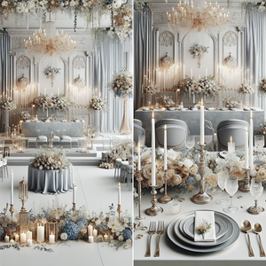
How to Choose Wedding Colors for Your Style and Venue
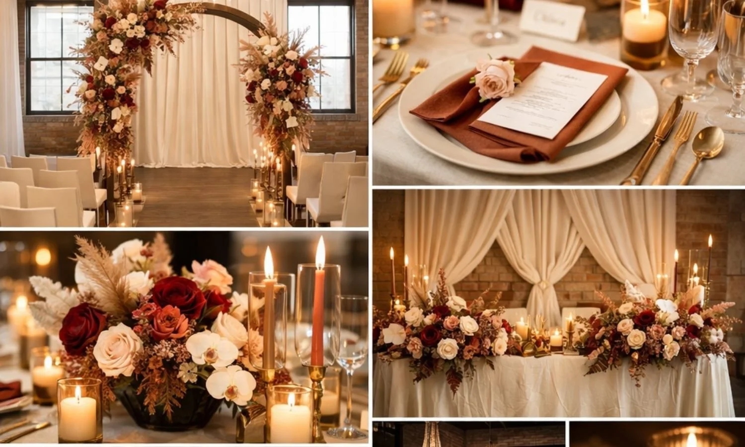
Terracotta, Burgundy, Gold, Ivory & Cream Color Palette - perfect for an Autumn Wedding
Hi lovely,
Have you saved a little bit of everything? A blush wedding here, a blue table setting there, and now you’re wondering how to choose your own wedding colors?
Start with your venue and one color you love, then build a few supporting shades around it. You don’t need every flower, napkin, and bridesmaid dress figured out just yet.
Let’s walk through your style, venue, season, and color combinations. There are palettes below to help you get started, along with our free tools if you’d like to try your own ideas.
How a Wedding Color Palette Helps You Plan
Your colors will show up in your flowers, linens, dresses, stationery, and all those little details you’re collecting. Having a palette in mind gives you something to come back to when there are lots of lovely options.
It also gives your vendors a clearer idea of what you like. You don’t need to have it all finalized today—a starting point is enough.
Step 1: Define Your Wedding Style
Start With the Feeling You Want to Create
Think about how you’d like your wedding to feel. Soft and romantic? Relaxed and outdoorsy? Full of color? Start with the look you’re drawn to, even if you don’t have a name for it.
Look through your saved photos and notice what keeps showing up. Maybe it’s dusty blue napkins, burgundy flowers, or warm ivory and champagne. Pick one shade you keep coming back to and use it as your starting point.
Here are a few style and color combinations to explore:
You don’t have to fit into one category. You might love a little vintage detail with a modern table setting, or bright flowers in a romantic garden. Take the parts you like and build from there.
Step 2: Let Your Venue Guide You
Take a Look at Your Space
Your venue is already part of your palette. Take a look at the floors, walls, chairs, and curtains that will sit alongside the decor you bring in.
Notice the colors and lighting in your venue photos. Warm wood might inspire ivory and rose, while a light, neutral room gives you lots of options. The combinations below are starting points—you can try something different if you love it.
You don’t have to match the room. If your barn has warm wood everywhere, you could soften it with ivory linens, dusty rose flowers, and greenery. Think about which colors you enjoy alongside what’s already there.
Love the colors. Wondering about your venue?
That’s why we created the Design Studio. Upload your venue photo, add your colors and inspiration, and see how your ideas could look in your own space.
See My Colors in My VenueStep 3: Consider the Season
Take a Little Inspiration From the Season
Your wedding date can give you ideas, especially if you’re not sure where to start. But you don’t have to choose a palette just because it’s associated with your season.
Here are a few seasonal combinations to try:
Love dusty rose for a winter wedding or navy and gold for summer? You can absolutely explore those. Let the season help you narrow things down without ruling out your favorites.
Visualize your wedding color palette right now
Have a few colors in mind? Choose your style, colors, and venue type, and we’ll bring them together in a mood board you can save and share.
Create My Free Mood BoardStep 4: Build Your Palette Around 3 to 5 Colors
Anchor, Complement, Accent
Three to five colors are a manageable starting point. Try one main color, one or two supporting shades, and an optional accent. A neutral can be one of your supporting shades.
Start with the color you love most. It might show up in your flowers, dresses, or linens—you can decide how much of it you want as you go.
Next, add supporting shades. Burgundy could sit alongside dusty rose and ivory. Sage could work with cream and pale gold. Try them together and adjust anything that feels too strong or too similar.
An accent can be a small touch in your candles, ribbon, or stationery. You don’t need equal amounts of every color. Ivory linens with burgundy napkins will feel quite different from burgundy linens with ivory napkins, even though the palette is the same.
Here’s one way to put that together:
Dusty Rose, Sage, Ivory, Gold and Taupe
Try ivory linens, dusty rose flowers, sage greenery, and small gold details. Taupe could appear in ribbon or stationery.
See Your Favorite Colors Together
If you’re torn between two palettes, seeing them applied to flowers and table settings can help. Keep the style and setting similar so it’s easier to focus on which colors you prefer.
Our Wedding Mood Board Creator brings your colors and favorite details together. You can create two free boards, so there’s room to compare a couple of ideas.
Want to adjust the shades first? Try the free Wedding Color Palette Creator and save a palette to share. Once you have a direction, our wedding flowers by color guide can help you find blooms to discuss with your florist.
Frequently Asked Questions
How many colors should a wedding color palette have?
Three to five is a helpful starting point, but there’s no required number. Think about where each shade will go. You can also use variations of one color if you prefer a simpler look.
Should my wedding colors match my venue?
They don’t need to match. Look at your colors alongside the room’s existing features and see what you like together. You may want to pick up a shade from the venue, or add something different with your flowers and linens.
What wedding color palettes can I try for 2027?
If you’re planning for 2027, try combinations such as midnight blue and silver, chocolate brown and ivory, or blush and champagne. Our 2027 wedding color palette guide has more ideas to explore. Choose the ones you love rather than feeling you have to follow a trend.
Can I have two anchor colors in my wedding palette?
Yes! Try both together, then decide how much of each you’d like to use. One might work across larger details while the other appears in flowers or napkins. A neutral can help balance the combination.
How do I communicate my wedding colors to vendors?
Share a palette card and a few images that show how you’d like to use the colors. Our Color Palette Creator gives you a reference to bring along. Check physical samples before ordering, too—hex codes are a digital reference, and colors can look different on screens, in fabrics, and under your venue’s lighting.
What if I can’t decide between two color palettes?
Try a mood board for each, keeping the other details similar. Our Wedding Mood Board Creator includes two free boards. If you have your venue photo ready, you can also explore how your ideas could look in your space with the Design Studio.
Ready to see your palette come to life?
Choose your style, colors, and venue type, and let’s bring your favorite details together in a mood board you can save and share.
Create My Free Mood Board