Strawberry Matcha Wedding - The Color Palette Taking Over in 2026

The strawberry matcha wedding color palette is one of the most talked-about trends in bridal design right now, and it is easy to see why. The combination of soft strawberry pink and earthy matcha green creates a palette that feels fresh, modern, and genuinely unexpected without being difficult to work with. It is the kind of color story that looks effortless on a mood board and even better in real life.

What makes strawberry matcha so appealing as a wedding palette is how naturally the two colors balance each other. The warmth of the pink softens the earthiness of the green, and the green keeps the pink from feeling too sweet. Together they hit a note that is romantic, grounded, and quietly sophisticated. We are seeing it show up everywhere from intimate garden ceremonies to modern indoor receptions, and it works beautifully in both.

Want to see this palette styled for your wedding?
Try our free Wedding Color Palette Creator to build your own strawberry matcha combination and download a shareable palette card.
Try the Palette Creator

The Strawberry Matcha Color Palette

At its core, strawberry matcha is a two-tone palette built around warm pink and muted green. The magic is in how you layer the supporting shades around those two anchors. Here is the palette we love most for weddings.

Strawberry
Blush Rose
Matcha
Sage Mist
Warm Cream

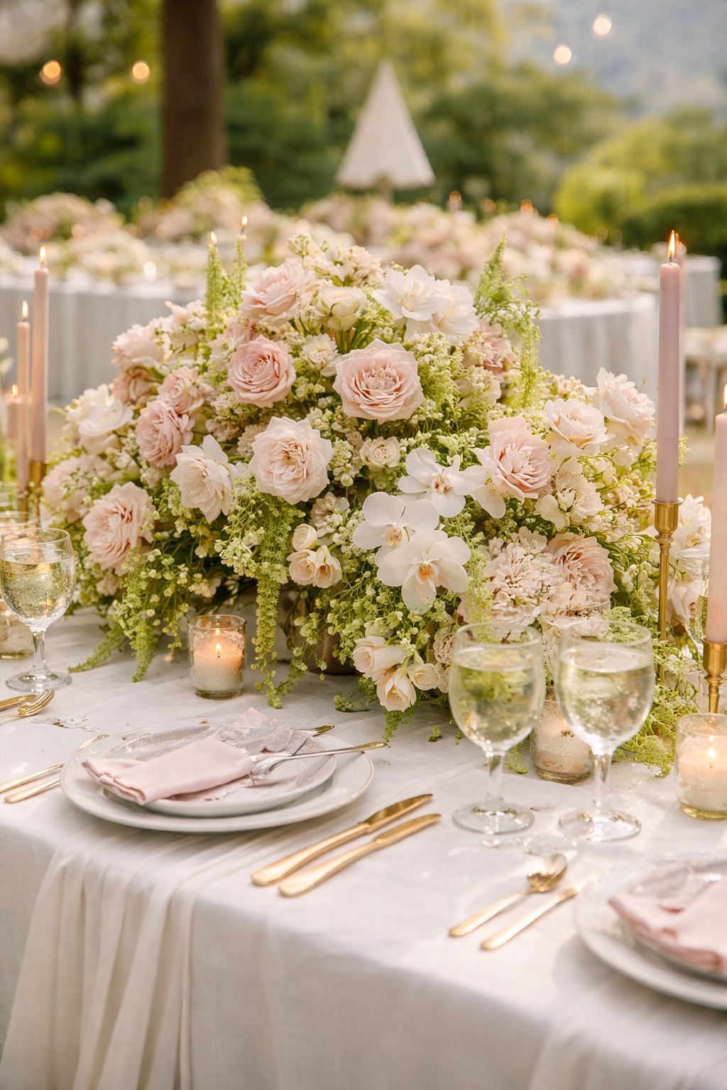
The strawberry sits at the heart of the palette, giving it warmth and vibrancy. Blush rose softens the overall look and bridges the gap between the pink and green tones. Matcha anchors everything with earthy depth, sage mist provides breathing room, and warm cream keeps the whole thing feeling light and airy rather than heavy.

Strawberry matcha works because neither color dominates. The key is keeping the pink warm and the green muted. The moment the green goes too bright or the pink goes too cool, the palette loses its balance.


How to Style a Strawberry Matcha Wedding

This palette is versatile enough to work across every element of your wedding. Here is how to bring it to life across the details that matter most.

Florals
Let the flowers carry the color story

Florals are where strawberry matcha really comes alive. The combination gives your florist two strong anchors to work with and a lot of creative range in between. Some of our favorite picks for this palette:

  • Garden roses and ranunculus in strawberry, blush, and soft coral for the pinks
  • Eucalyptus, fern fronds, and scabiosa pods for the matcha and sage greens
  • White sweet peas or cream peonies to add softness and breathing room
  • Dried strawflowers in warm rose tones for texture and a modern edge
  • Trailing ivy or hanging amaranthus for movement and depth

The best strawberry matcha arrangements lean lush and slightly wild rather than tightly structured. Think loose, romantic, and full of variety rather than precise and formal.

Table Setting
Build contrast through texture and tone

The table is where this palette has the most opportunity to shine. A few combinations that work particularly well:

  • Warm cream or ivory linen tablecloths as the base, with strawberry pink napkins folded simply at each place
  • Terracotta or blush ceramic tableware to reinforce the warm tones without adding more pink
  • Antique brass or warm gold flatware and votives for a modern, editorial feel
  • Low centerpieces with matcha-toned greenery and loose strawberry rose clusters
  • Sage green taper candles in simple brass holders for vertical interest

Avoid cool-toned whites or silver hardware. Strawberry matcha runs warm, and the table setting should reinforce that. Brass, terracotta, and warm ivory are your best friends here.

Try it free

See your strawberry matcha
palette come together

Our free Wedding Mood Board Creator helps you visualize this palette styled across your full wedding aesthetic before you commit to a single thing.

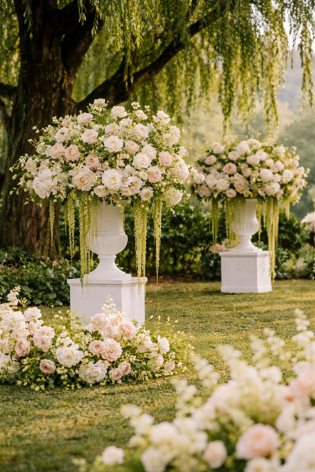
Create My Free Mood Board 2 free boards included · free to try
Ceremony Decor
Frame the moment with the palette

For the ceremony, concentrate the palette in your arch or backdrop, your aisle markers, and your seating. A few ideas that translate beautifully:

  • A garden arch draped with matcha-green foliage and loose strawberry rose clusters at the base and crown
  • Simple wooden chairs or natural rattan seating to echo the earthy green tones
  • Aisle markers with small bud vases alternating between strawberry roses and sage-green eucalyptus stems
  • A pampas grass and dried botanical installation as a ceremony backdrop for a more contemporary take
  • Cream-colored pillar candles in varying heights flanking the ceremony space
Stationery and Details
The small things make the palette feel intentional

Stationery and paper goods are one of the easiest ways to establish your palette early and carry it through every touchpoint. For strawberry matcha, the combination of warm ink tones and botanical illustrations feels especially on-brand:

  • Invitation suites in warm cream with strawberry or blush ink and hand-drawn botanical details
  • Wax seals in matcha green or antique gold for an elevated finish
  • Menus and place cards printed on sage-toned card stock with warm-toned script
  • Ribbon in blush or strawberry pink for wrapping ceremony programs or favors
  • A cake with sage green buttercream and fresh strawberry rose accents for a finishing detail that ties everything together

Strawberry Matcha by Venue and Season

This palette is more adaptable than it looks. Here is how it shifts depending on where and when you are getting married.

Strawberry Matcha Garden
In a garden or outdoor setting, lean into the natural connection between the matcha green and the surrounding landscape. Let the greenery of the venue do some of the work. Use strawberry pink as the accent color throughout florals and linens rather than the dominant tone, and you end up with something that feels completely native to the space.
Perfect for: Garden Estate · Winery · Botanical Garden · Outdoor Terrace
Strawberry Matcha Warm Earthy
For fall or indoor venues, deepen both tones slightly. A richer strawberry and a darker matcha give the palette warmth and drama that suits the season. Add terracotta, warm linen, and antique brass accents and the result is sophisticated and grounded. This version of the palette feels less like a trend and more like a considered design choice.
Perfect for: Vineyard · Barn · Industrial Venue · Candlelit Indoor Space
Strawberry Matcha Soft & Airy
Pull both tones back to their softest, most pastel versions and the palette becomes delicate and dreamy. Blush rose rather than true strawberry, sage mist rather than full matcha. This version suits couples who love the concept but want something lighter and more ethereal. It photographs beautifully in natural light and pairs perfectly with soft linen, white florals, and candlelight.
Perfect for: Greenhouse · Minimalist Venue · White Chapel · Modern Loft
Refine your palette

Build your exact
strawberry matcha mix

Our free Wedding Color Palette Creator lets you adjust the balance of pink and green until it feels exactly right, then download a card to share with your florist and decorator.

Try the Palette Creator Free Free to use · downloadable palette card included

Frequently Asked Questions

Strawberry Matcha Wedding Questions, Answered

What is the strawberry matcha wedding color palette?
The strawberry matcha wedding palette is a color combination built around warm strawberry pink and earthy matcha green, typically softened with blush rose, sage mist, and warm cream as supporting tones. It became popular as a wedding palette because the two anchor colors balance each other in a way that feels fresh and modern without being difficult to work with across florals, linens, and decor.
Is strawberry matcha a good color palette for a wedding?
Yes, and it is one of the more versatile trending palettes we have seen in a while. It works across a wide range of venues and seasons, and it gives florists and decorators strong anchors to work with. The key is keeping the pink warm rather than cool, and the green muted rather than bright. When those two conditions are met, the palette is forgiving, photogenic, and genuinely beautiful in person.
What flowers work best for a strawberry matcha wedding?
Garden roses, ranunculus, and sweet peas in strawberry and blush tones are the strongest choices for the pink side of the palette. For the greens, eucalyptus, fern fronds, scabiosa pods, and trailing ivy all complement the matcha tone beautifully. Cream peonies or white sweet peas work well as a soft neutral to add breathing room throughout the arrangements. The best strawberry matcha florals lean loose and lush rather than tight and structured.
What venues work best for a strawberry matcha wedding?
Strawberry matcha is one of those palettes that adapts well across different settings. It looks stunning in garden and outdoor venues where the matcha green connects naturally to the surrounding landscape. It also works beautifully in vineyards, greenhouses, and warm indoor spaces like candlelit barns or modern lofts. The version of the palette shifts slightly depending on the venue: softer and airier outdoors in spring, deeper and richer indoors in fall.
What accent colors work well with strawberry matcha?
Warm cream and ivory are the strongest neutrals for this palette. For metallic accents, antique brass and warm gold are ideal because they reinforce the warm tone of the strawberry without competing with it. Terracotta works beautifully as a third earthy tone alongside the matcha. Avoid cool silvers, stark whites, or navy accents, as these fight the warmth at the core of the palette and make it feel disconnected.
Is strawberry matcha still trending for 2026 and 2027 weddings?
Yes. Strawberry matcha has moved from a social media aesthetic into a genuine wedding design palette with real staying power. We are seeing it requested by couples across all venue types and seasons, which is usually a sign that a trend has found real traction beyond the initial buzz. It is fresh enough to feel current and grounded enough to hold up beyond the trend cycle.
How do I build a strawberry matcha mood board for my wedding?
The best place to start is our free Wedding Color Palette Creator, which lets you build and fine-tune your exact pink and green combination before downloading a palette card for your vendors. From there, use our Wedding Mood Board Creator to pull the palette into a full styled vision with decor, florals, and ambiance. Together they give you a clear, shareable creative brief before you spend a single dollar.
What is the difference between strawberry matcha and sage green wedding palettes?
Sage green wedding palettes use green as the dominant anchor, typically paired with ivory, blush, or warm neutrals. Strawberry matcha uses green and pink as co-anchors of roughly equal weight, which gives the palette a much stronger visual energy and a more contemporary feel. Sage green leans soft and understated. Strawberry matcha leans fresh and intentional. Both are beautiful, but they create very different moods.
J
Jennifer · Founder, WeddingDecor.com

WeddingDecor.com was built on the belief that a beautifully designed wedding should not require a massive budget or a team of stylists. Color is almost always where it starts, and getting that right makes every other decision easier. We hope this guide helps you find a direction that genuinely feels like you.

Ready to start?

Your strawberry matcha wedding
starts with the palette

Use our free Wedding Color Palette Creator to build your exact combination and download a palette card to share with your vendors. Then bring it to life with a custom mood board.

Try the Palette Creator Free Free to use · or start with a mood board →

Want to explore multiple palettes side by side? The Dream Wedding Bundle gives you 12 custom mood boards for just $19.98, one time.

Jennifer

Creating & helping to make the world a better place. ✨💖

Next
Next

Wedding Flowers by Color: Some of Our Favorites