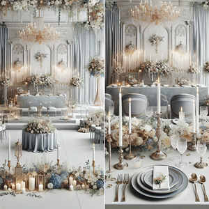
Dusty blue and blush wedding color palette
Dusty blue and blush, sage and champagne, terracotta and cream: a good wedding color combination gives you a starting point for the flowers, fabrics and smaller details. The next step is deciding how those colors will work in your venue.
Here are 35 wedding color palettes to compare, grouped by style. Each has one strip of five coordinating shades, with color names and hex codes you can save for reference. You can use just a few of the shades or build on the full combination.
Which Wedding Colors Go Together?
For a softer palette, start with dusty blue and blush or sage and champagne. Burgundy and gold gives you a deeper option, while terracotta and cream suits warmer wood and stone. Navy and ivory offers a stronger contrast.
Choose one shade you want to see most, then add a neutral and a few supporting colors. Look at the walls, floor and furniture in your venue before settling on the final mix.
Already have a color in mind? Explore different shades in the free Wedding Color Palette Creator. If you want to see a styled direction first, try the Wedding Mood Board Creator.
Hex codes describe digital colors. Fabrics, flowers and metallic finishes can look different in person, so compare physical samples before ordering. The gold and silver swatches suggest a color direction; a screen cannot show a metallic finish.
Romantic Wedding Color Combinations
These palettes work with soft flowers and lighter fabrics. Choose the strongest shade for a few details, then decide how much of the neutral base your venue needs.
1. Dusty Blue and Blush
- Dusty Blue
#7C8FA8 - Blush
#F2C6C9 - Ivory
#F6F2EA - Mist
#D8DDE3 - Soft Grey
#BFC4C8
Use dusty blue napkins with ivory linens and blush flowers. Mist and soft gray can sit in the stationery or ribbon, leaving the tables mostly light.
2. Sage Green and Champagne
- Sage Green
#9BAF9D - Champagne
#EADDC8 - Ivory
#F8F5F0 - Taupe
#B9ADA6 - Soft Peach
#F3C7B8
Let sage lead through napkins or dresses, with champagne and ivory across the tables. A few peach flowers bring warmth to the greenery.
3. Champagne and Soft Peach
- Champagne
#E7D6C6 - Soft Peach
#F4C4B7 - Ivory
#F9F6F1 - Blush
#EEC8C8 - Gold
#D6B46B
Try champagne linens with ivory flowers and a little peach. Use gold in a few table details, then repeat blush in ribbon or the printed menus.
4. Lavender and Silver
- Lavender
#C9B7E3 - Silver
#D9D9DC - White
#FFFFFF - Pearl
#F0EAF7 - Blue Grey
#BCC6D7
Lavender flowers and white linens give this palette a light base. Silver details and blue-gray napkins can carry the cooler shades through the reception.
5. Navy and Blush
- Navy
#2F3E63 - Blush
#E8B6C2 - Ivory
#F7F3EB - Taupe
#C8B6A6 - Cloud
#D6DCE6
Keep the tables ivory and use navy for the napkins or stationery. Blush flowers soften the darker blue, while taupe works with natural wood chairs.
Modern and Formal Wedding Color Combinations
For a more defined look, try a deeper shade against white or ivory. The amount of dark fabric you use will change the room more than a small metallic accent.
6. Black and White
- Black
#1C1C1C - White
#FFFFFF - Soft Grey
#CFCFCF - Champagne
#E9E2D6 - Stone
#8E8E8E
White flowers and linens give black details a clear outline. Try black stationery or candleholders, with champagne fabric to add some warmth.
7. Emerald and Gold
- Emerald
#1F4F4A - Gold
#D4AF37 - Ivory
#F7F3EB - Champagne
#E8DCC8 - Moss
#6F7D5C
Emerald makes a stronger statement in full tablecloths than in napkins. Choose how much green the room needs, then use gold sparingly and keep the flowers ivory.
8. Burgundy and Gold
- Burgundy
#6B1E2E - Gold
#C8A96A - Ivory
#F6F1E9 - Mauve
#9B6D74 - Sand
#D7C4B1
Burgundy flowers and mauve ribbon sit well against ivory linens. Let gold appear in the table details, with sand as a quieter supporting neutral.
9. Navy and Champagne
- Navy
#2E3955 - Champagne
#E7D2B5 - Ivory
#FBF8F2 - Greige
#CFC5B6 - Honey
#9A7B55
Navy napkins on champagne linens give a softer contrast than navy on bright white. Ivory flowers and warm wood details can carry the lighter shades.
10. Charcoal and Blush
- Charcoal
#595A5C - Blush
#E7C9D2 - Ivory
#F7F4EF - Taupe
#C8BCAE - Oyster
#E4E1DA
Charcoal stationery or napkins give pale blush flowers some definition. Keep the larger table surfaces ivory, with taupe and oyster in smaller fabric details.
Make a palette your own
Use the Wedding Color Palette Creator to adjust shades and save a combination to share with your florist or decorator. The hex codes above give you a starting point.
Open the Free Palette CreatorWarm and Earthy Wedding Color Combinations
Look at the wood, brick and stone already in the venue. These palettes give you several ways to work with those warmer surfaces.
11. Terracotta and Cream
- Terracotta
#C46A4A - Cream
#F4EFE7 - Dusty Rose
#CDA1A5 - Sand
#D7C6B1 - Olive
#7B7F5C
Terracotta napkins and dusty rose flowers work against cream linens. If your venue has wood or stone, use those existing textures to carry the sand and olive tones.
12. Terracotta and Sage
- Terracotta
#B95D3E - Sage
#9FA08A - Ivory
#F6F1E7 - Dusty Peach
#D5A392 - Linen
#E1D4C0
Try sage foliage with terracotta and peach flowers on an ivory tablecloth. Linen-colored fabric gives the warmer shades a quiet backdrop.
13. Burnt Orange and Ivory
- Burnt Orange
#C56A2E - Ivory
#F4F0E8 - Caramel
#E4C3A0 - Clay
#A77C67 - Cream
#FFF6EE
Use burnt orange in the flowers or napkins, with cream across the tables. Caramel and clay suit warm wood chairs or simple ceramic vases.
14. Cinnamon and Champagne
- Cinnamon
#9B5A3B - Champagne
#E8D9C8 - Ivory
#F8F5EF - Camel
#C59A7A - Rose Beige
#DAB1A4
Cinnamon works well as a fabric accent beside champagne and ivory. Rose-beige flowers can soften the brown tones without adding a separate strong color.
15. Clay and Peach
- Clay
#A26C55 - Peach
#F2DDC8 - Ivory
#F8F4ED - Sand
#D4BFAE - Soft Nude
#E6B7A5
Let peach flowers carry the lighter color, with clay in the napkins or vessels. Ivory linens give the warmer neutrals enough contrast to remain distinct.
Soft Pastel Wedding Color Combinations
Pastels can vary from warm and creamy to cool and gray. Compare samples together so your pale shades sit comfortably beside one another.
16. Soft Blue and White
- Soft Blue
#A8BBD1 - White
#FFFFFF - Pearl
#EEF2F3 - Mist
#D4DCE1 - Sand
#C7C0B8
White flowers and soft blue napkins suit a bright room. Sand-colored details add warmth if the venue already has cool gray floors or walls.
17. Sage Green and Dusty Blue
- Sage Green
#9EAE9F - Dusty Blue
#A9B9CE - Ivory
#F8F5F0 - Stone
#D9D4CC - Blush
#E7CED0
Mix dusty blue and sage in the fabrics, keeping the flowers mainly ivory with a few blush blooms. Stone can repeat the room’s existing neutral finishes.
18. Blush and Gold
- Blush
#F1CCD6 - Gold
#D6B46B - Ivory
#FFF9F4 - Champagne
#E8DED1 - Dusty Rose
#CFA4AD
Blush flowers and ivory linens make an easy base. A little dusty rose gives the flowers depth, while gold can appear in frames or candleholders.
19. Powder Blue and Silver
- Powder Blue
#B9CAE3 - Silver
#D5D8DE - White
#FAFAFA - Lilac Grey
#C4B8CC - Linen
#E6E1D8
Powder blue napkins and white flowers keep the tables light. Use lilac gray in ribbon or stationery and a linen shade to soften the cooler colors.
20. Lilac and Ivory
- Lilac
#D6C6EB - Ivory
#F6F2EC - White
#FFFFFF - Dove
#C8C0C9 - Soft Sage
#D9E2D3
Try lilac flowers with white linens and pale green foliage. The dove shade works in printed details or ribbon when you want a little more definition.
Colorful Wedding Palettes
Choose where you want the most color to appear. Flowers are a useful place to mix several shades while keeping the linens simple.
21. Coral and Peach
- Coral
#F28D7A - Peach
#F4CDBD - Ivory
#FFF7F1 - Nude
#CFA48F - Butter Yellow
#F0D96F
Let coral flowers stand out against ivory linens. Peach and butter yellow can appear in smaller blooms, with the warmer neutral repeated in stationery.
22. Dusty Blue and Butter Yellow
- Dusty Blue
#90A9C4 - Butter Yellow
#F2D65C - Ivory
#F8F5EF - Mist
#D4DCE6 - Soft Sage
#B9C9A5
Blue napkins and pale yellow flowers create a clear contrast on ivory tables. Mist and sage keep the supporting details quieter.
23. Lavender and Peach
- Lavender
#C7B2E4 - Peach
#F3CCB7 - Ivory
#FFF7F2 - Mauve Mist
#D9D2E5 - Linen
#E7DCCB
Combine lavender and peach flowers, then keep the linens ivory. A few mauve-gray ribbons or printed details are enough to carry the cooler accent.
24. Soft Pink and Sage
- Soft Pink
#E8C2CF - Sage
#A9B99C - Ivory
#FAF6F0 - Sand
#D7C4BA - Petal
#EFE4E0
Use sage in the napkins and soft pink in the flowers. Ivory and sand can fill the larger surfaces, with the palest pink in paper or ribbon.
25. Periwinkle and Ivory
- Periwinkle
#AEB8ED - Ivory
#F8F4EF - Mist
#DADFE8 - Mauve Grey
#CBB9D8 - White
#FFFFFF
Periwinkle can lead through dresses or napkins, while ivory flowers keep the tables softer. Mauve-gray details help connect the blue and purple tones.
See your colors with flowers and decor
Choose a style, setting and colors in the Wedding Mood Board Creator to explore how your ideas could look together.
Create My Free Mood BoardTwo free boards delivered by email. No account or credit card needed.
Soft and Natural Wedding Palettes
Muted greens and warm neutrals suit settings where you want the room or landscape to stay visible. Texture gives these quieter colors some variation.
26. Butter Yellow and Sage
- Butter Yellow
#EEDB78 - Sage
#A9B794 - Ivory
#FAF7EF - Sand
#D4C7B0 - Oatmeal
#E8E1D2
Try butter yellow flowers with sage napkins and ivory linens. Sand and oatmeal work through woven details, stationery or the venue’s existing furniture.
27. Blue and White
- Blue
#8FAFC8 - White
#FFFFFF - Sea Mist
#DCE7F0 - Sand
#D7D0C2 - Soft Green
#C7D7C8
Blue fabric and white flowers suit a lakeside or coastal setting. Bring in sand-colored details and soft green foliage to connect the colors to the surroundings.
28. Mocha and Champagne
- Mocha
#8B725F - Champagne
#E7D7C6 - Ivory
#F8F5F1 - Greige
#C6B3A6 - Nude Rose
#B69A8A
Mocha napkins or menus bring warmth to champagne linens. Keep flowers ivory and use the rose-toned neutral in a few smaller details.
29. Olive Green and Cream
- Olive Green
#7D8663 - Cream
#F4EFE6 - Champagne
#E6DAC6 - Sand
#D1C3AC - White
#FFFFFF
Olive pairs naturally with cream fabrics and ivory flowers. Champagne and sand can appear through textured linens or warm wood details.
30. Pale Blue and Silver
- Pale Blue
#B8CBE0 - Silver
#D8DCE2 - Ivory
#F8F6F1 - White
#FFFFFF - Mauve Mist
#C9B7CF
Pale blue flowers or napkins can lead this cooler palette. Keep silver details restrained, with ivory and mauve mist softening the white.
More Neutral and Classic Combinations
These final palettes offer different balances of pale neutrals and deeper accents. Adjust the proportions to suit your venue.
31. Dusty Rose and Taupe
- Dusty Rose
#C8A0A6 - Taupe
#B6A79E - Ivory
#F8F4EF - Petal
#E5D4CF - Champagne
#D9C2A6
Dusty rose flowers work with taupe napkins and ivory linens. Champagne adds a little warmth, while the palest pink can sit in ribbon or stationery.
32. Emerald and Ivory
- Emerald
#214F4B - Ivory
#F5F1E8 - Champagne
#D9C9AE - Olive
#9EA883 - White
#FFFFFF
Use emerald in a few larger fabric details if the room is light. Ivory flowers and olive foliage keep the green shades connected across the tables.
33. Black and Champagne
- Black
#222222 - Champagne
#E8DCC8 - Ivory
#F7F3EC - Greige
#BBB2A8 - White
#FFFFFF
Black napkins or stationery add definition to a mostly champagne and ivory setting. White flowers give the warmer fabrics a lighter point of contrast.
34. Latte and Champagne
- Latte
#A27A6A - Champagne
#DCCBB8 - Ivory
#F7F3ED - Taupe
#C4B2A0 - Nude
#EAD9C9
Build this neutral palette through texture: linen tablecloths, matte stationery and soft flowers. Latte and taupe help the champagne shades remain distinct.
35. Blue Grey and White
- Blue Grey
#AFB9C7 - White
#FFFFFF - Ivory
#F7F4EE - Sand Gold
#D8C5A8 - Sea Glass
#C9D7E2
Blue-gray napkins work against white or ivory linens. Use sea-glass tones in the flowers or paper details, with sand gold adding a warmer accent.
How to Choose Your Wedding Color Scheme
- Look at your venue first. Include the flooring, walls, furniture and outdoor scenery. A palette that works with those existing colors can be easier to carry through the room.
- Choose where the main color will appear. Full tablecloths cover a lot of space. Napkins or flowers give you a smaller amount of the same color.
- Add lighter and deeper shades. You might use blush for most of the flowers, a little dusty rose for depth and ivory across the tables. Each shade can have a different role.
- Compare physical samples. Look at fabrics and stationery together in daylight and under the venue’s evening lighting. Texture and sheen can change the way a shade appears.
- Share a clear direction with your vendors. Bring a palette, a venue photo and a few references. Explain what you like about each image and allow some flexibility with flower shades.
Choosing Colors for Your Season and Setting
For a spring garden wedding, soft greens, blush and lavender are options to explore against the existing planting. For a summer reception, blue and white or coral and peach can work with a brighter outdoor setting. Fall gives you room to try terracotta, burgundy or mocha against warmer surroundings, while a winter indoor reception may suit emerald, navy or layered neutrals.
Let the venue and local climate guide the choice. A fall beach wedding and a fall reception in a dark timber barn may need very different amounts of color.
For more ideas, browse Spring Wedding Colors 2027, Fall Wedding Colors 2027 and our garden wedding color palettes. Our 2027 wedding color palette guide focuses on ideas for the year.
Bring Your Palette Into Your Flowers and Venue
Once you have a color direction, use our Wedding Flowers by Color guide to identify flowers to discuss with your florist. Flower shades vary naturally, so the palette can guide the overall mix without requiring every bloom to match a code.
Try your colors in your wedding venue
Upload a venue photo to the Wedding Design Studio and explore how your colors could look with flowers and decor in the space.
Try My First Venue Design FreeCreate an account for your first free venue design. No credit card needed. Use the result to discuss a design direction with your vendors.
Wedding Color Questions
What wedding colors go together best?
Dusty blue and blush, sage and champagne, terracotta and cream, navy and ivory, and burgundy and gold are options to explore. The best combination for your wedding depends on the venue, the colors you love and how much of each shade you plan to use.
How many colors should a wedding palette include?
Start with a main color, a neutral and one or two supporting shades. The five colors in each palette offer flexibility; you do not need every shade in every detail. Different shades of the same color can help flowers and fabrics coordinate naturally.
How do I choose wedding colors for my venue?
Look at the walls, flooring, furniture and outdoor scenery before choosing fabrics and flowers. Compare your preferred colors against a venue photo, then check physical samples in the room’s lighting.
Should bridesmaid dresses match the flowers exactly?
They can coordinate without matching exactly. You could choose dresses in the main palette color and use related shades in the flowers. Compare actual fabric samples and floral references before deciding.
Can I mix warm and cool wedding colors?
Yes. Dusty blue with peach, lavender with cream, or sage with champagne are combinations to explore. Repeat a neutral across the linens or stationery to help connect the warmer and cooler shades.
Can a wedding color palette work in any season?
Many combinations can work across seasons. Change the balance of lighter and deeper shades, and choose textures and flowers that suit the date and setting. Your venue’s existing colors also matter.
Can I use these hex codes for wedding fabrics and flowers?
Use hex codes to explain the digital color direction. Fabrics and flowers will vary with material, lighting and natural color differences. Order physical fabric samples and discuss flower shades with your florist.
How can I create my own wedding color palette?
Use the Wedding Color Palette Creator to explore and adjust your shades. Then try the Wedding Mood Board Creator to explore a styled direction, or the Wedding Design Studio to try a look in a photo of your venue.